A dear friend who lives in Poland created a Renko Bar for me to go along with a Fibonacci indicator she also created for me. I’ve been using a 2 tick Renko Bar chart to fine tune entries and define risk or exit strategies for intraday trading since.
I learned how to read charts using minute timeframes and I’ve used a 15 minute chart for intraday setups for quite some time but since my Renko bar was created for me, I’ve been saying, I’d really like to switch my 15 minute charts to higher Renko bar charts, comparable to 15 minute rotations but the bars are derived by a totally different means that specific time formed bars (or candlesticks). But like a habit, the minute chart was difficult to let go, but this week I began the transformation to only use Renko bar charts for my intraday charts.
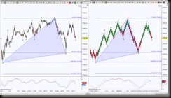
So here’s a side by side view of the same low to high initiative move followed by a 78.6% retracement, forming a triangle, which I happen to use for harmonic patterns but back to Renko!
The 15 minute chart had several rotations inside the initiative move from the 1747 low to the 1764 high, the 6 tick Renko bar chart shows “noise” removed in the initiative move, once the bars turned green, the implication was to exit an existing short position, enter or stay in a long position.
Wondering how the Renko Bar works? In a nutshell, it has Japanese origin, and only has to do with price movement rather than time and or volume. It creates a new bar (originally called a ‘brick’) every time price moves beyond the top or bottom of a previous bar a predetermined amount.
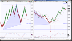
Now let’s look at how I like to use the larger sized Renko Bar (previously a larger timeframe using minutes) and fine tuning entries and exits using a 2 tick Renko Bar in ESZ13 charts.
The red arrow on the 6 tick chart is the conservative long entry once the bar turns green around 1755 region. The 2 tick chart triggers a change in momentum when the sub graph indicator has a fast line cross above a slow line, this is an aggressive entry, a conservative long entry is shown when there’s at least two green bars above the Bollinger Band midline.
If the initial conservative opportunity to enter a long position was missed there’s another opportunity to either enter or add to an existing position when 1) the fast line crosses back above the slow line and or 2) when the green bars are back above the Bollinger Band midline.
So whether you’re an aggressive trader, conservative trader or both, there are triggers for each style.
As for risk, there’s specifics that can be used for all styles of traders. When entering a long position, as long as the bars stay green the position is good for the ride, for more confirmation, as long as price holds above the Bollinger Band midline, even higher probability of staying in for a Harmonic Pattern target, or whatever is used for scaling or exits. Once price holds below the Bollinger Band midline accompanied by at least two red bars, it’s a probability that the move is shifting energy and time to tighten the position, scale, or exit all together.


